Rule 2 | Work with line bundles
Lesson 9 | Can the sketch stand up to things?
15 min. |
Test the significance of your stroke by placing other things next to your sketch. Put your sketch next to other things and see what happens with your lines.
Step 1 | About layouting
The most important rule of layout is that everything should be aligned with the grid.
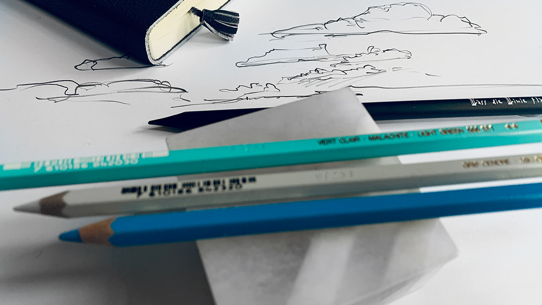
Take a few belongings that are on your desk so that you are ready for the layout afterward.
Script
Hello and happy sketching.
This time we are not going to sketch, but we are going to prove if our sketch can prove itself in the layout with other things. That’s why we are going to do a layout with some items that we have on our drawing tables. I have here some ink, a booklet, and my aquarelle paint box, some utensils to draw and a scissor. I want to make a layout. And what does it mean to do a layout
Okay, I take all the stuff away. My stage is the table. I want to find out which one of those sketches is better, the first one or the second one. And that’s why I arranged them in a context as if they would be a part of a book. So what is the main thing when you do a layout in a book or in a newspaper? You have a grid. Whatever you do, you have a grid. Meaning a grid has horizontal lines like floors that hold a building and you have columns like houses that hold the structure of a house. So wherever you put your stuff here is my camel. It’s not looking to this side because yeah, it could be so in this direction it would like to look to the coming. But I would like him to orient to the sketches. That’s why I’m putting him here. Or even a part more to the left here. And then I have the two pictures. I’d like to have them more something that looks similar, I have a Copic marker to shade my drawings. But actually, I want to put it together with the crayon, something that has not that much contrast to the background. What can I do with my scissors or with my paint box? I put it here, this paint box. It’s leaping out of the structure. But this doesn’t matter because this is the part that is not that important. I’m putting the scissors here. So this is oriented to the right as well. Maybe I can put this down. I align all the stuff. I lean all the stuff to the grid so that it goes here. That is an imaginary line. But since we do all the stuff into the grid, we should put other stuff out of the grid. So I can even amount things. Or shall I put it like this? So here I have a column that goes through, but not totally, but it goes through. Here I have a column as well. But actually what I think is very important to know is that you do not have to apply the rule of using a grid totally. So you can always 5% go out of the grid and then it looks even nicer. Now I have the problem that I have almost nothing in the middle. How can I solve this problem? I need something with a little bit of contrast. I could put it here. Something like this? Yeah, why not? Maybe this wasn’t a good idea to put it here maybe it would be nicer to have it open without anything going to the border on the right side. Yeah, that’s something like this. So when I have arranged all the stuff that I have the feeling afterward it’s settled on this background, then I have something that we can call a layout that is working for our stuff.
And now is the questions. When I have all put it together in my layout, which one of the drawings is the better one? What do you think? Yeah, it’s all about contrast so here you have more contrast, you have a thicker line, more black on the line then it’s even better and I do know something … I enhance the contrast again and you see it’s even more compelling. I do a similar thing here but actually, you can easily find out this doesn’t work because the lines are too faint we lose the picture of a cat.
Speaker 1 (06:41)
How can we solve this? That’s not so easy. We can take more black, same lines, same lines because the lines are not a problem but the darkness of the lines is the problem. I just pronounce the lines a little bit more and here you see what happens, now it’s easier to detect than it is a cat and now it works better. So what we can learn from this is that we have really to apply contrast and then our drawings speak the concise language and this is what we want in our drawings. Try out making the same thing. Put them to some layout stuff, whatever you have on your desk and step one meter back and look at it and tell yourself which line is the best for a good appearance in layouting. Happy sketching.


It is all about the grid
A grid is always made up of columns and rows. The columns are there to structure things, and the rows to carry things. No, things are not placed imprecisely. They are arranged as if they had real weight. So dark things look heavier, and that’s why they tend to fall over. The layout has to compensate for this.
On the left, the ink pad is heavy. I lifted it with the coloured pens.
Everything is placed in boxes. And between the fields, the narrow spaces, they are called gutters, there is usually nothing. These are the visual supports, similar to the supporting structure of a house.
Things usually lean against these gutters.
When everything is beautiful, everything is calm. That’s how beauty is defined in the design of a layout.

ASSIGNMENT | Make your layout with a sketch for proofing
To upload, use the buttons further down.
Free trial
Try one lesson and decide if you want to do the whole course. Click for the free trial ...

Certificate
If you want to achieve a certificate that proves your sketching skills, get all your information here ...