Rule 5 | highlight the line
Lesson 5 | MAYA – The new in the guise of the already known. What is a tree?
30 min.
The French-American industrial designer Raymond Loewy summarised the challenge of depicting the new in the abbreviation MAYA. „Most Advanced, Yet Acceptable“.
Step 1 | Understand how far you can go with innovation
We like the new as long as it reminds us of the old
We realise that we can only sell people something new in the guise of something familiar. This led to the seemingly contradictory instruction that a design should be both typical and original.
In other words, Loewy believed that successful design should not be too far ahead of its time and that it should be relatable and intuitive to its intended audience. The acronym MAYA represents this principle: Most Advanced, Yet Acceptable.
Good design allows us to rediscover it again and again
The paradox of good design and the new design is the main challenge in sketching.
If something is visually easy to process, it basically feels good. Something that feels good at first sight is referred to as beautiful.
So we conclude: Beauty is not in the eye of the beholder but in the processing liquid itself. Processing liquidly so is the term for the process that sends an image to the brain to decipher it. The more liquid the processing goes, the more beautiful a picture is.
That is why we consider simple, symmetrical, and contrasting designs to be beautiful.
And that’s why we like all the original and reduced designs: they are the prototypes.
It is all about the essence of the things.
This is how we explain beauty.
But there is something on the other side. The world is not just made up of minimalist designs. The world is full of fancy stuff. This is starting there, where the professionals work.
The more often we see unusual designs, the more familiar they become, which constantly raises the threshold for easy processing. This also explains why the opinions of amateurs and experts often differ: The experts find it easier to work with complex designs, so they like them better. At the same time, simple shapes are more boring.
The conclusion for a designer and even more an artist is to rise the threshold of the liquid procession
How can the threshold be raised? By exposing oneself to the new, by looking at the new and foremost at the art. Or by surrounding oneself with the beauty in everyday life.
The bust of Emanuel Kant on the philosopher’s desk has helped many men to think. Because it sets the threshold for the superior and professional.
The bust of Beethoven has helped many a musician.
The muses helped the painters.
Why shouldn’t the draughtsmen join them? Online museums are genuine sources of inspiration.
Whatever you do: balance innovation and familiarity. This is the key to good-looking things.
Let’s go on an excursion into the arts
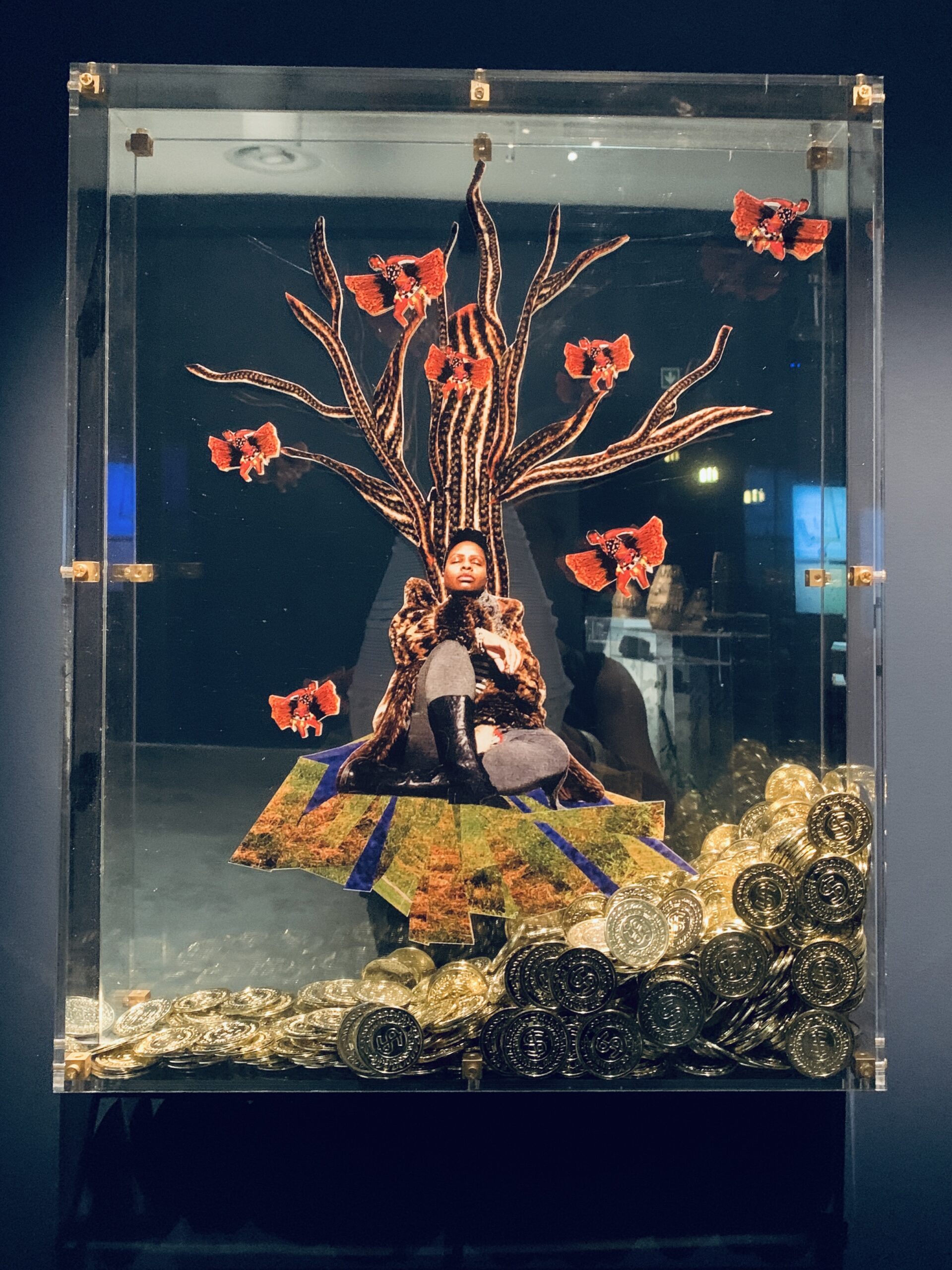
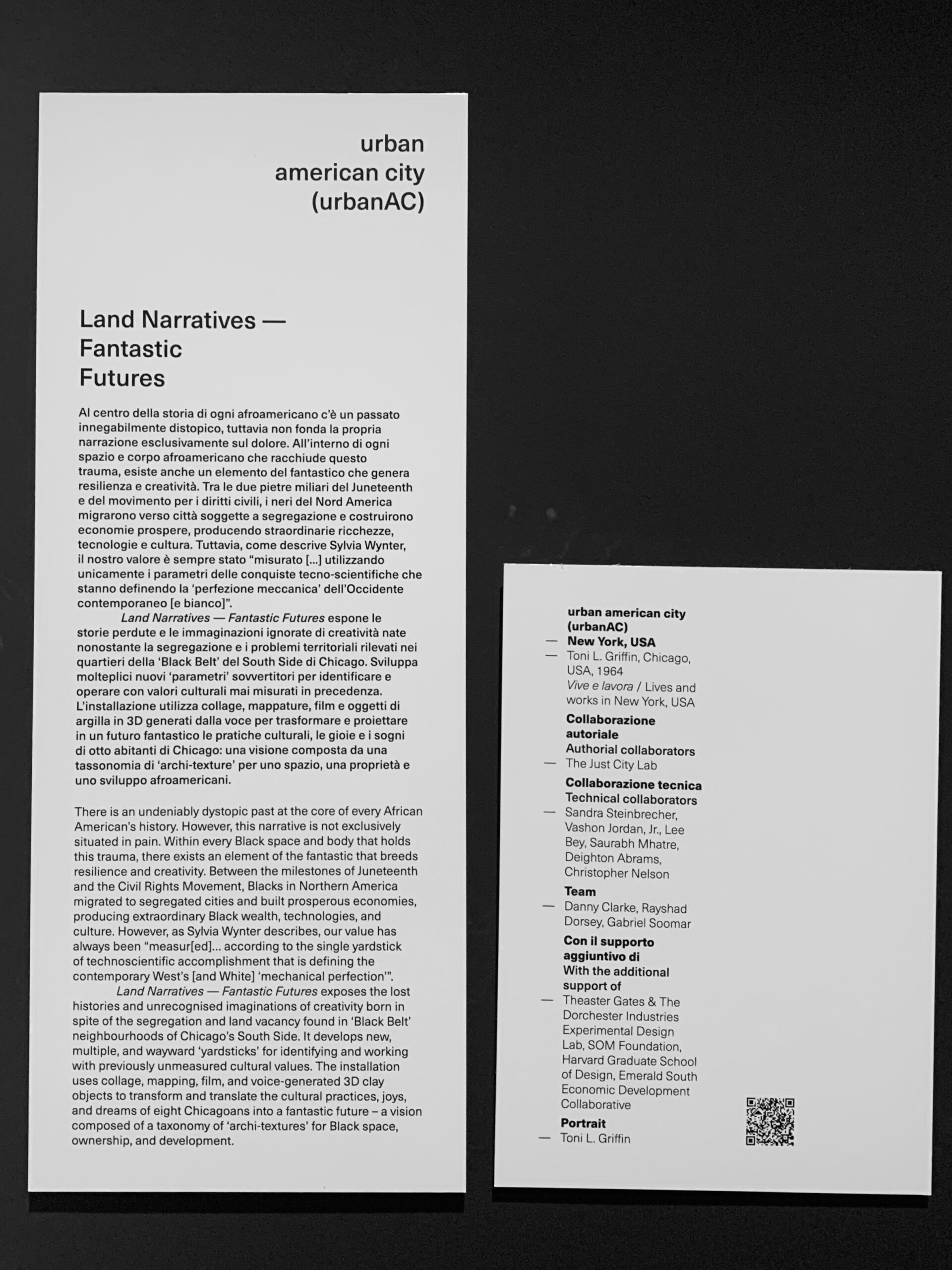
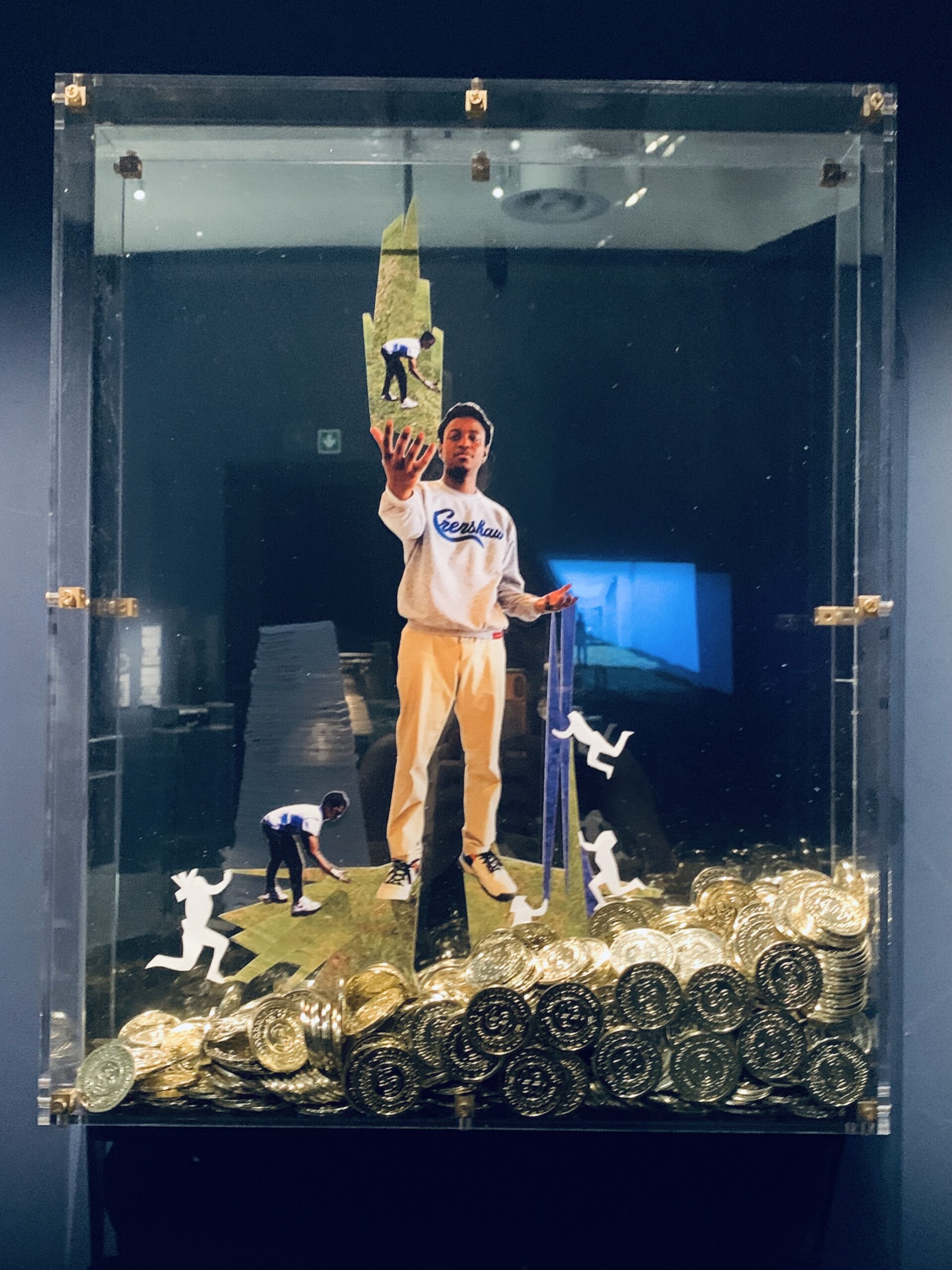
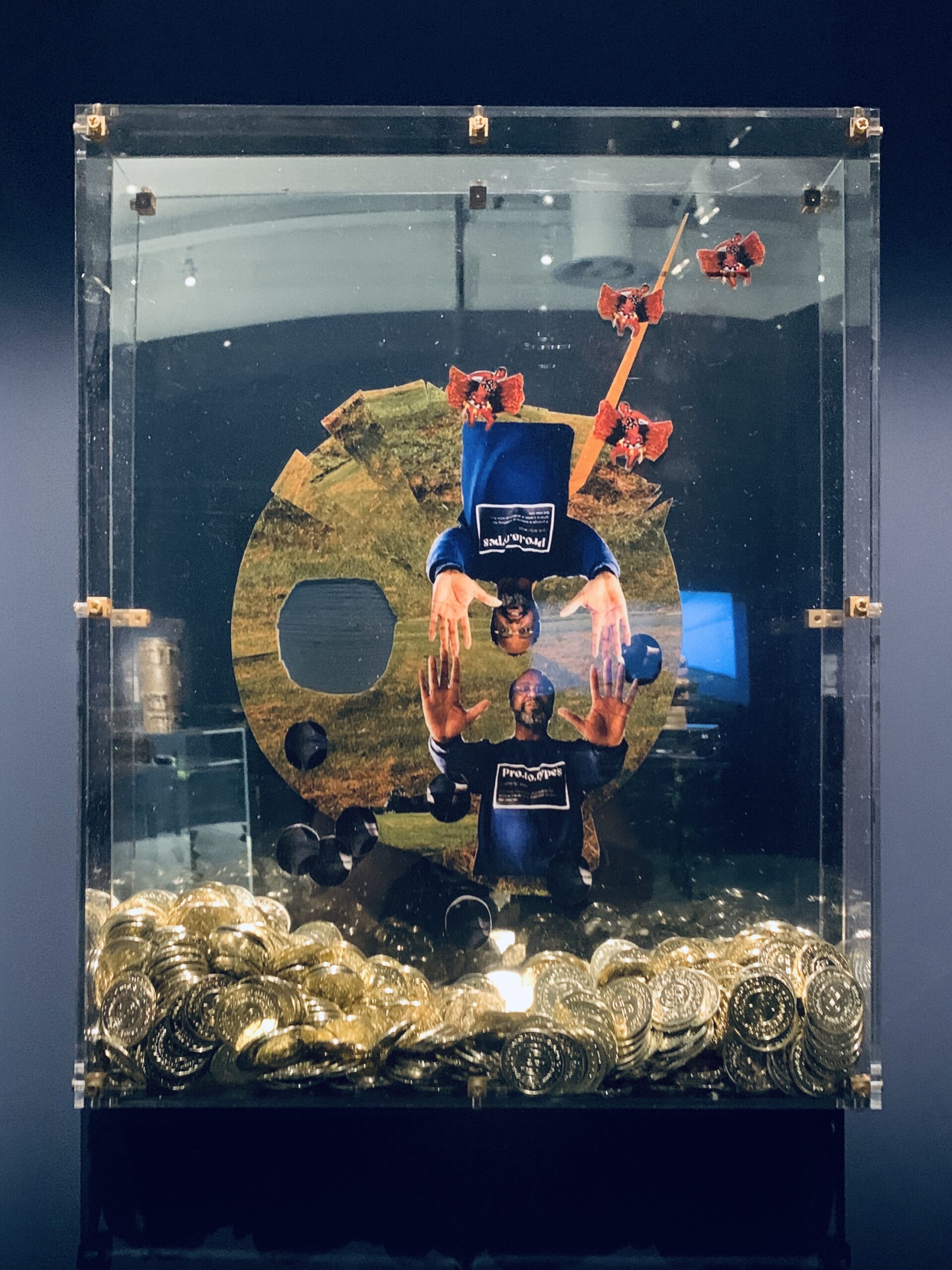
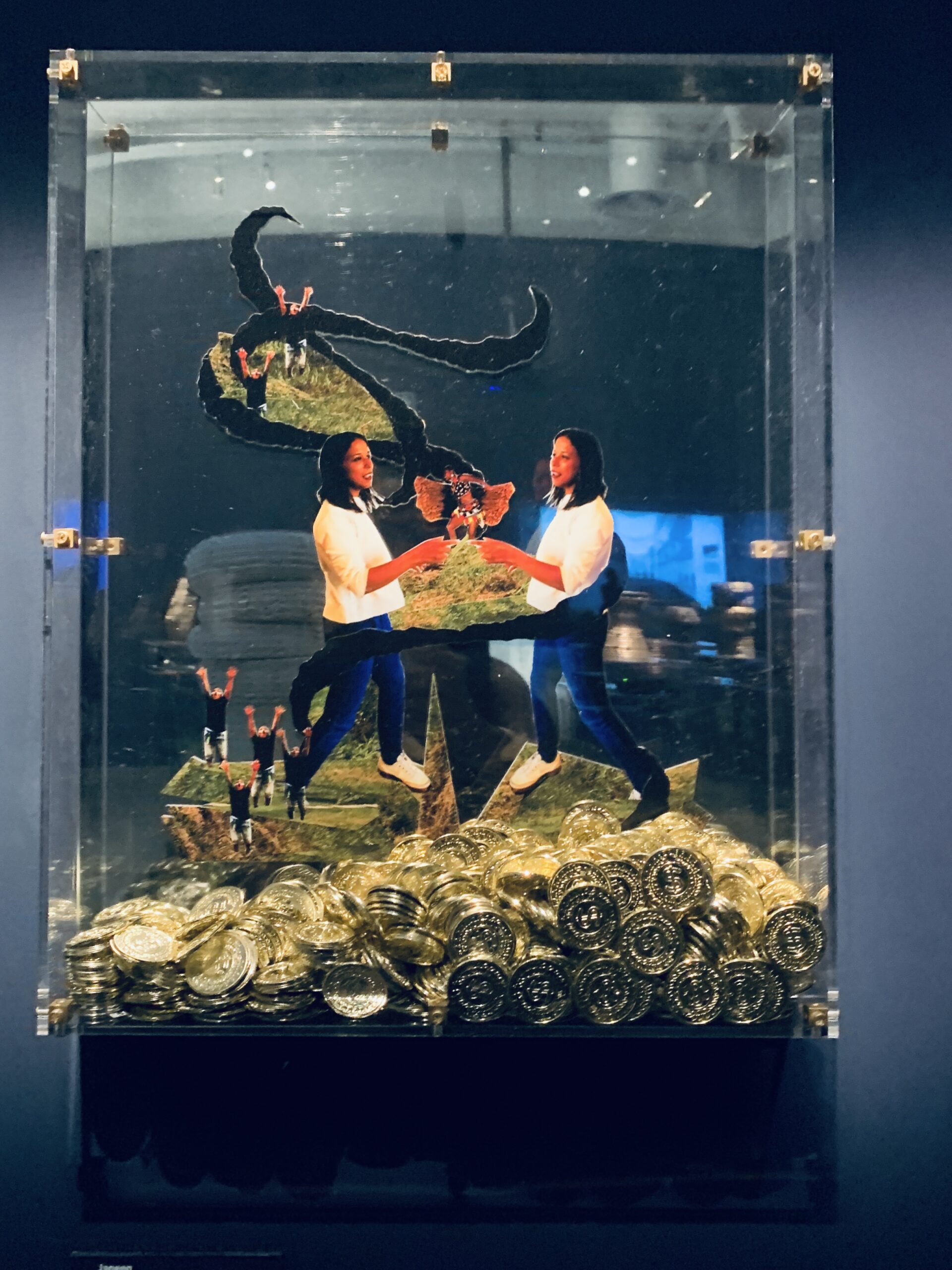
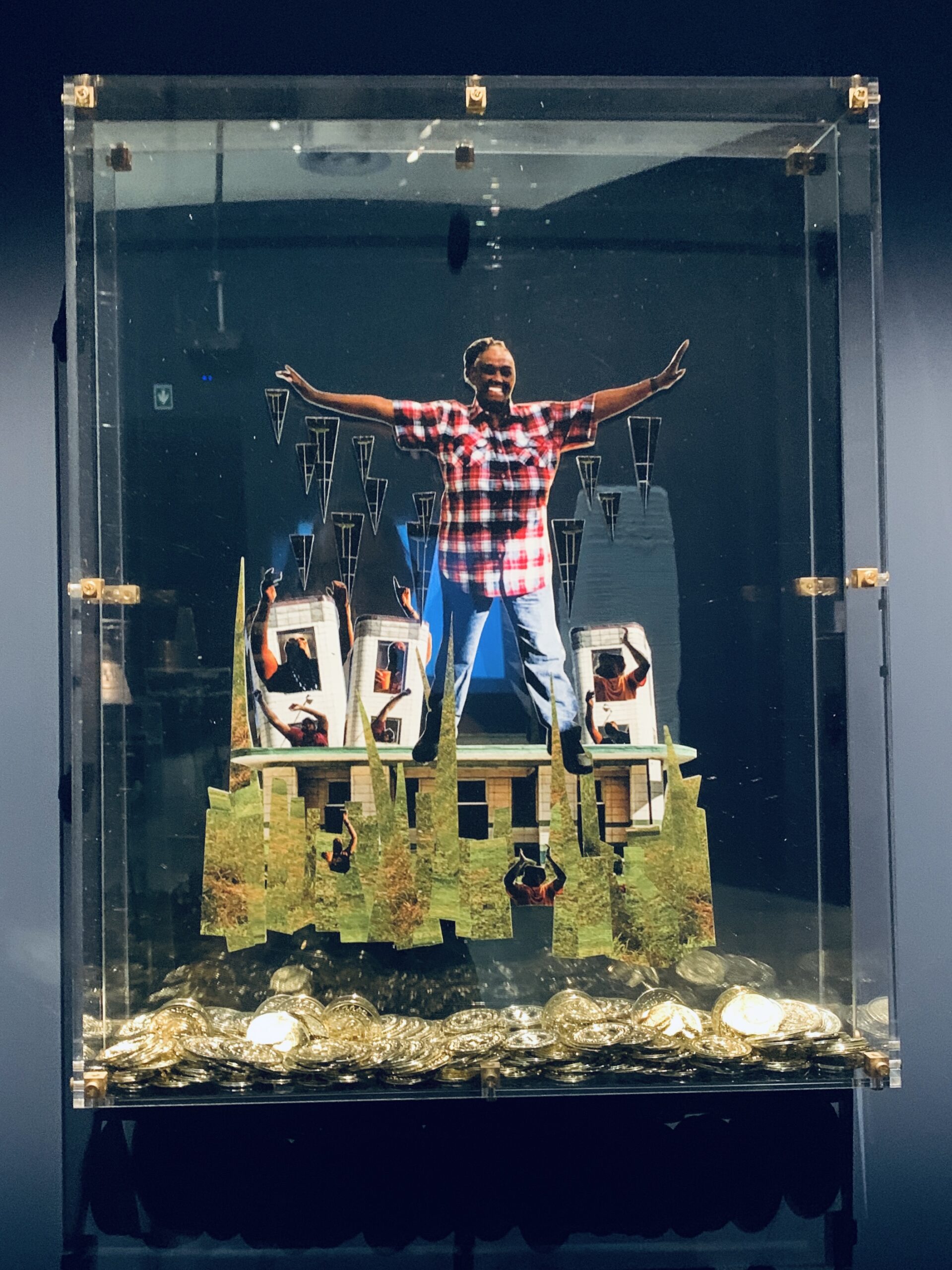
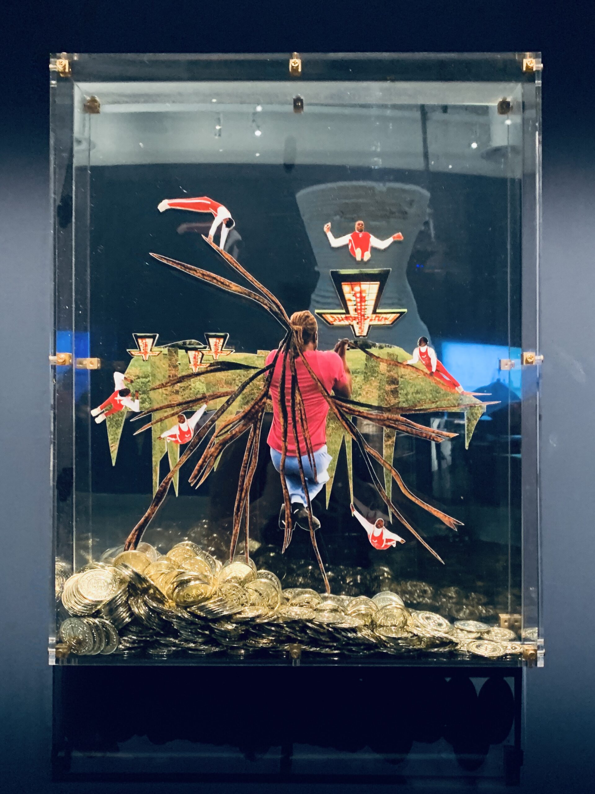
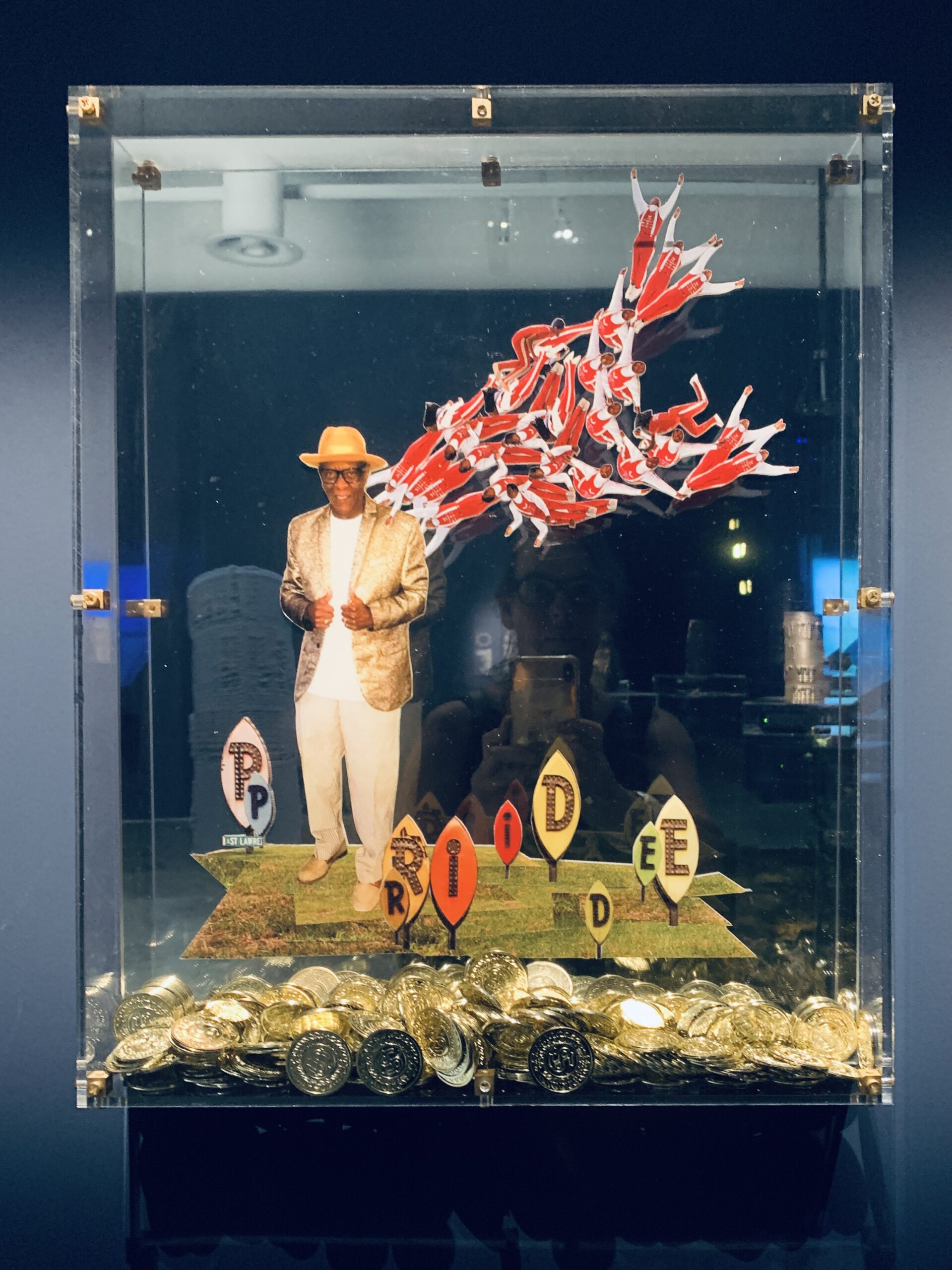
The images shown here all originate from the 2023 Venice Biennale. They illustrate the Maya principle not through drawing, but through art installations.
About the artwork
In this collection, the artwork experiments with deliberate cuts in the representations—people are reduced to limbs, which are then transformed into new objects, akin to metamorphosed butterflies. These interventions challenge perception and invite reflection on how identity and humanity are depicted and perceived in modern society.
Gravity, a traditional anchor of perception and stability, is defied. Objects and structures that typically stand vertical, suggesting stability, are tilted, symbolizing the instability of social and economic conditions. Like walls set askew signaling imminent collapse, they compel the viewer to question their understanding of the world.
The use of coins or tokens adds another dimension, bridging the two-dimensional world of the collages with the three-dimensional world of objects. These elements act as a conduit between the past and a visionary future, representing both prosperity and the challenges of economic disparity in the urban living spaces of African American communities.
These artistic techniques are embedded within a broader narrative conveyed through the „Land Narratives — Fantastic Futures“ installations. It is a vision of the future built on a complex foundation of history, technology, and architecture, shaped by the creative expression and collective experience of African American culture.
Analyzing the artworks from the Venice Architecture Biennale
Analyzing the artworks from the Venice Architecture Biennale 2023 within the framework of MAYA, we can identify several areas where these principles manifest:
Familiar Yet Novel: The collages incorporate familiar elements, such as human figures and urban landscapes, but place them in novel arrangements that challenge typical perceptions. This plays into MAYA by pushing the boundaries of the familiar to create something new and engaging, yet not entirely alien to the observer.
Scale and Symbolism: The principle of MAYA is evident in the manipulation of scale within the collages. Objects lose their expected proportions, and symbolic signs point to deeper meanings. This aligns with Loewy’s idea that consumers accept innovations more readily when they are presented within a familiar context—here, the context is the visual language of symbolism within urban life.
Disruptive Cuts: The physical cuts in the collages, which transform body parts into new objects like butterflies, introduce a degree of abstraction and transformation while still retaining recognizable human elements. This embodies MAYA as it presents a progressive idea (evolution or change) in an accessible form (the human body).
Defying Gravity: By altering the orientation of the expected vertical structures, the artworks create a sense of instability and dynamism. This challenges the viewer’s sense of balance and comfort, a nod to MAYA’s push for advancement, yet it remains grounded in the familiar concept of gravity and structure.
Coins/Tokens as a Bridge: The coins or tokens serve to extend the two-dimensional collages into the three-dimensional space of objects. This not only connects the art to the tangible reality of economics and material value but also to the metaphorical value of historical and cultural wealth. The use of these tangible items respects the MAYA principle by providing a relatable entry point into the more abstract themes of the artwork.
In these collages, the MAYA principle is respected by introducing advanced concepts of identity, community, and future possibilities through recognizable and relatable mediums. The artworks push viewers to explore new perspectives on African American experiences and futures while grounding them in the familiarity of urban life, personal identity, and communal history.
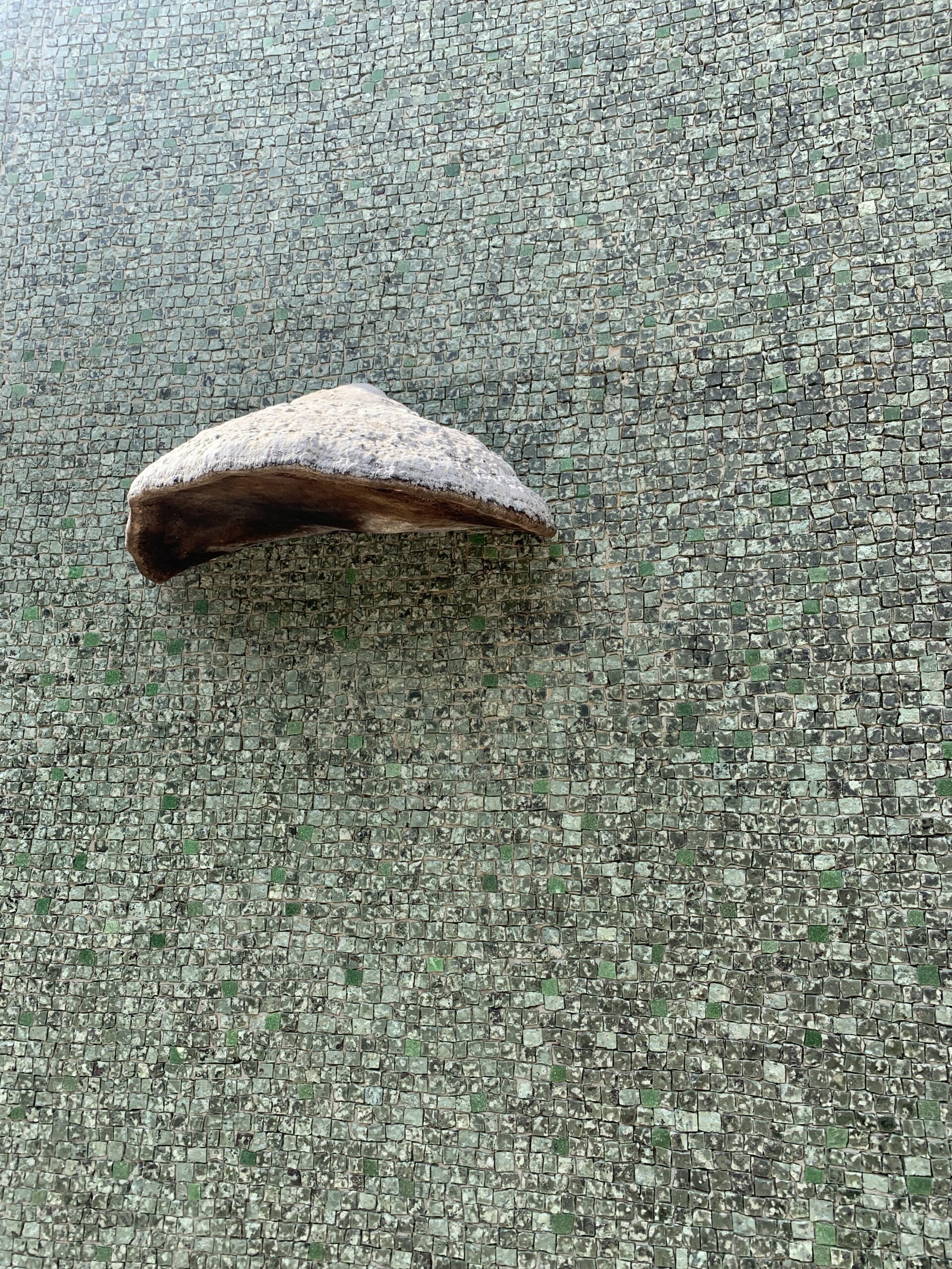
Here, a tinder fungus was mounted on a building wall. While these mushrooms normally grow on dead trees, here they have been mounted on the façade of an exhibition pavilion made of mosaic stones. Here, the threshold of the natural habitat has been crossed.
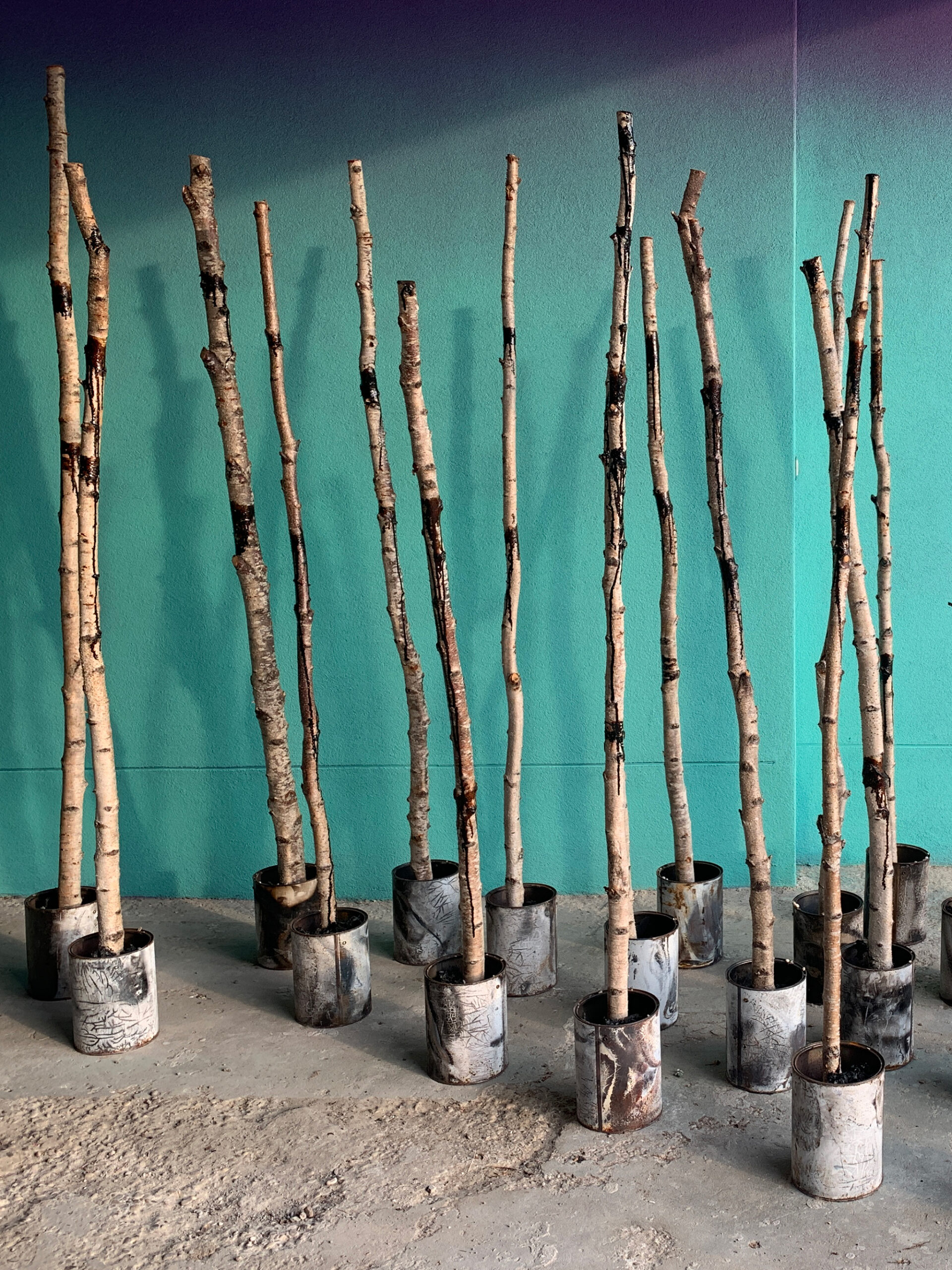
This artwork takes the familiar form of trees or plant life—objects that everyone is used to—and presents them in a more advanced, artistic context. The transformation of these natural elements into an art installation elevates the commonplace to something novel. The branches standing in metal containers symbolize a blend of the natural world with the industrial, merging organic shapes with man-made structures, which is familiar yet advanced in its conceptual presentation.
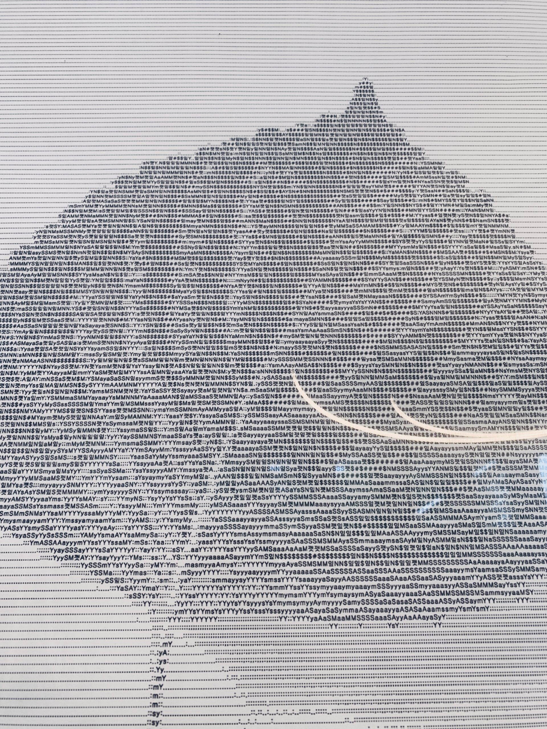
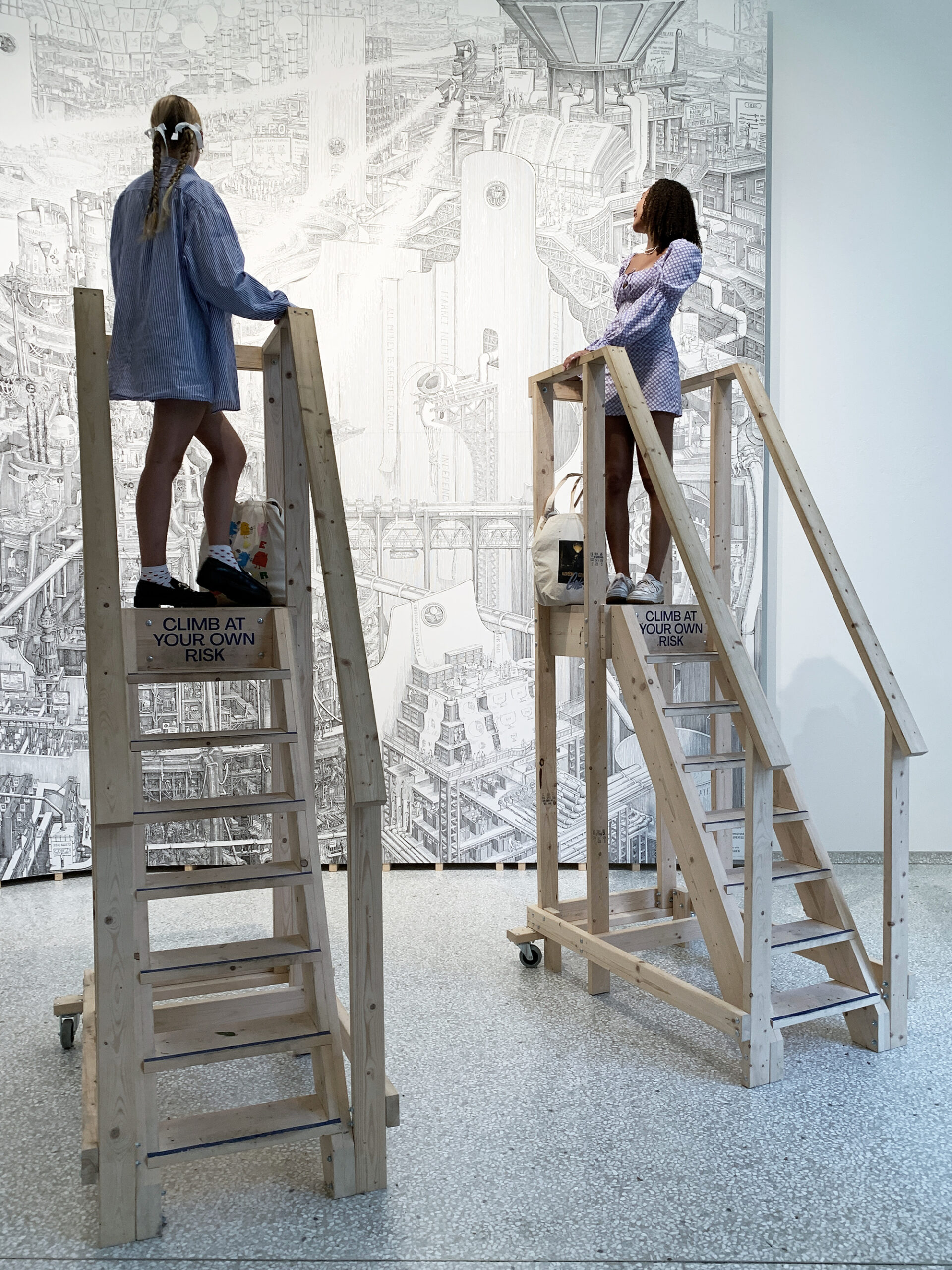
Here, we worked with the sifting of the format. The artist drew the entire financial process in an oversized representation. The threshold of the scale was pushed. The cartoon is giant and the people are diminutive concerning it. To emphasize this, these stairways have been built. They enable the viewer to look at the content closely despite the obstacles caused by the proportions.
Go to the museums and fill your visual repository
Guggenheim
The Guggenheim has made more than 1,700 pieces of its permanent collections in New York, Venice, and Bilbao available online for free. Here are some highlights, from Monet to Robert Mapplethorpe.
The MoMA Collection
The evolving collection contains almost 200,000 works of modern and contemporary art. More
than 102,000 works are currently available online.
Louvre Paris
Visit the museum rooms and galeries, admire the palace architecture, and enjoy the views!
To the museum …
Museum Ludwig
Today the Museum Ludwig is home to one of the most important collections of twentieth- and twenty-first-century art in the world. And, unlike royal collections, it owes its existence to the extraordinary dedication of private citizens.
THE MET
The Met presents over 5,000 years of art from around the world for everyone to experience and enjoy. The Metropolitan Museum of Art collects, studies, conserves, and presents significant works of art across time and cultures in order to connect all people to creativity, knowledge, ideas, and one another.
The TATE Modern
The museums mission is to increase the public’s enjoyment and understanding of British art from the 16th century to the present day and of international modern and contemporary art.
MUSEUMMMK
Frankfurt am Main | Opened in 1991, the MUSEUMMMK für Moderne Kunst was one of Germany’s very first museums of contemporary art.
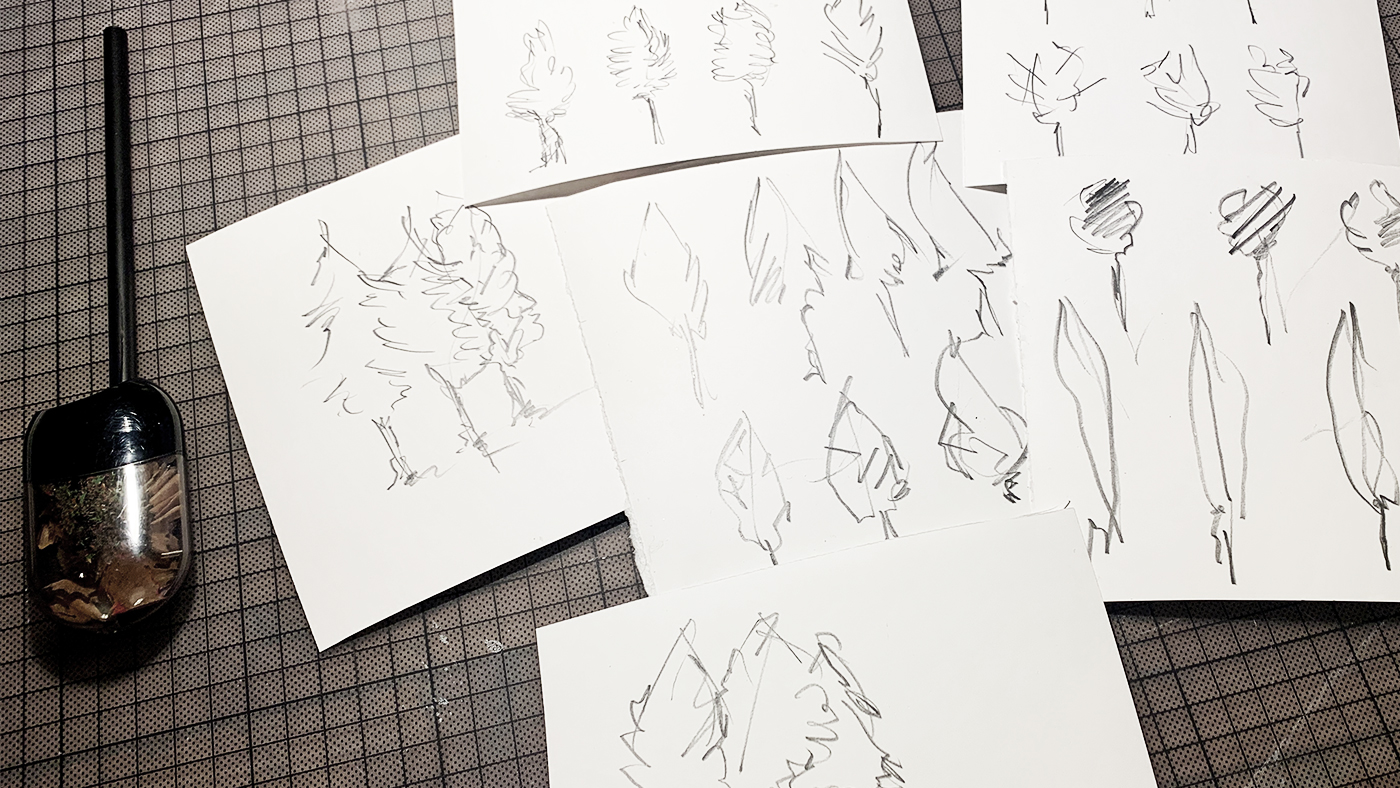
ASSIGNMENT | Fill your brain with as many images as possible and feel the threshold. Then go and sketch 100 trees!
To upload, use the buttons further down.
Free trial
Try one lesson and decide if you want to do the whole course. Click for the free trial ...
Certificate
If you want to achieve a certificate that proves your sketching skills, get all your information here ...

